Creating Toast Notifications in a Next.js Project with createPortal
Introduction
Toast notifications are a great way to provide feedback to users in a non-intrusive manner. While there are libraries like react-toastify you can easily integrate into your app, this guide is for those who want to actually learn how these things work behind the scenes. In this guide, I’ll walk you through how to implement a toast notification system with React’s createPortal. We’ll also ensure this implementation works seamlessly with Next.js’ new app router, which involves handling both client and server components.
Prerequisites
- A Next.js project setup. Please refer to this guide for the setup: https://nextjs.org/docs/getting-started/installation
Step 1. Create the Toast Component
Create a simple toast component at app/components. For notification icons, I’m utilizing react-icons.
"use client";

import React, { useEffect } from 'react';
import { FaInfoCircle, FaCheckCircle } from "react-icons/fa";
import { MdOutlineWarning, MdOutlineError } from "react-icons/md";
import { ToastType } from '@/customTypes/toast';

const icons = {
  info: <FaInfoCircle />,
  warning: <MdOutlineWarning />,
  success: <FaCheckCircle />,
  error: <MdOutlineError />
};

interface ToastProps {
  id: string;
  title: string;
  message: string;
  type: ToastType;
  onRemove: (id: string) => void;
};

export default function Toast({ id, title, message, type, onRemove }: ToastProps){
  useEffect(() => {
    const timeout = setTimeout(() => {
      onRemove(id);
    }, getTimeout());

    return () => {
      clearTimeout(timeout);
    };
  }, [id, type, onRemove]);

  const getTimeout = () => {
    switch (type) {
      case 'warning':
        return 6500;
      case 'error':
        return 8000;
      default:
        return 5000;
    }
  };

  return (
    <div className={`toast toast-${type} flex gap-2 z-50 pointer-events-auto`} role="alert" onClick={() => onRemove(id)}>
      <span className="toast-icon text-2xl">{icons[type]}</span>
      <div className="toast-content">
        <h4 className="toast-title font-bold">{title}</h4>
        <p className="toast-message text-sm">{message}</p>
      </div>
    </div>
  );
};
Note that ToastType is defined as follows:
export type ToastType = 'info' | 'success' | 'warning' | 'error';
Add some basic styles for the toast notifications in styles/toast.css.
.toast-container {
  position: absolute;
  pointer-events: none;
  width: 100%;
  max-width: 400px;
  max-height: 100vh;
  scrollbar-width: 0.35em;
  padding: 1em;
  bottom: 0;
  right: 0;
  display: flex;
  flex-direction: column-reverse;
  gap: 4px;
}

.toast {
  position: relative;
  align-items: center;
  padding: 10px;
  border-radius: 5px;
  box-shadow: 0 2px 10px rgba(0, 0, 0, 0.1);
  cursor: pointer;
  opacity: 0;
  animation: fadeIn 0.5s forwards;
  transition: box-shadow 0.2s ease-in-out, transform 0.2s ease-in-out;
  height: fit-content;
}

.toast:hover {
  box-shadow: 0 4px 15px rgba(0, 0, 0, 0.2);
  transform: translateY(-2px);
}

.toast-info {
  background-color: #d9edf7;
  color: #31708f;
}

.toast-success {
  background-color: #dff0d8;
  color: #3c763d;
}

.toast-warning {
  background-color: #fcf8e3;
  color: #8a6d3b;
}

.toast-error {
  background-color: #f2dede;
  color: #a94442;
}

@keyframes fadeIn {
  from {
    opacity: 0;
    transform: translateY(10px);
  }
  to {
    opacity: 1;
    transform: translateY(0);
  }
}
Step 2. Create the Toast Portal with createPortal
Import the Toast component we just created. We use React’s createPortal to render toast notifications at a root level so they appear above all other components. In this code, the root-level container is selected using querySelector. Read more about createPortal here: https://react.dev/reference/react-dom/createPortal.
Also note that the mounted variable is in place to check if the DOM is available before we try to query it. The mounted state is set to true after the initial render. For more details on using portals in Next.js refer to the offical example.
"use client";

import React, { useEffect, useState } from 'react';
import { createPortal } from 'react-dom';
import Toast from '@/components/toast';
import { ToastMessage } from '@/customTypes/toast';

interface ToastPortalProps {
  toasts: ToastMessage[],
  removeToast: (id: string) => void
}

export default function ToastPortal({
  toasts,
  removeToast
}: ToastPortalProps) {
  const [mounted, setMounted] = useState(false);

  useEffect(() => {
    setMounted(true);
  }, []);

  return mounted ? createPortal(
    <div className="toast-container" aria-live="assertive">
      {toasts.map((toast: ToastMessage) => (
        <Toast
          key={toast.id}
          id={toast.id}
          title={toast.title}
          message={toast.message}
          type={toast.type}
          onRemove={removeToast}
        />
      ))}
    </div>,
    document.querySelector('#main')!
  ) : null;
};
The ToastMessage type is defined as follows:
export type ToastMessage = {
  id: string;
  title: string;
  message: string;
  type: ToastType;
};
Step 3. Create the Toast Context
Next, create a context to manage the toasts. Create a new file contexts/ToastContext.tsx:
"use client";

import React, { ReactNode, createContext, useContext, useState, useCallback } from 'react';
import ToastPortal from '@/components/toastPortal';
import { ToastMessage, ToastType } from '@/customTypes/toast';

export interface ToastContextProps {
  showInfo: (title: string, message: string) => void;
  showSuccess: (title: string, message: string) => void;
  showWarning: (title: string, message: string) => void;
  showError: (title: string, message: string) => void;
}

export const ToastContext = createContext<ToastContextProps | null>(null);

export const useToast = (): ToastContextProps => {
  const context = useContext(ToastContext);
  if (!context) {
    throw new Error('useToast must be used within a ToastProvider');
  }
  return context;
};

export default function ToastProvider({ children }: { children: ReactNode }) {
  const [toasts, setToasts] = useState<ToastMessage[]>([]);

  const showToast = useCallback((title: string, message: string, type: ToastType) => {
    const id = Math.random().toString(36).substring(2, 9);
    setToasts(prev => [...prev, { id, title, message, type }]);
  }, []);

  const removeToast = useCallback((id: string) => {
    setToasts(prev => prev.filter(toast => toast.id !== id));
  }, []);

  const contextValue = {
    showInfo: (title: string, message: string) => showToast(title, message, 'info'),
    showSuccess: (title: string, message: string) => showToast(title, message, 'success'),
    showWarning: (title: string, message: string) => showToast(title, message, 'warning'),
    showError: (title: string, message: string) => showToast(title, message, 'error'),
  };

  return (
    <ToastContext.Provider value={contextValue}>
      {children}
      <ToastPortal toasts={toasts} removeToast={removeToast} />
    </ToastContext.Provider>
  );
}
Step 4. Integrate ToastProvider in Your Layout
import { Inter } from "next/font/google";
import ToastProvider from "@/contexts/toastContext";
import "@/styles/globals.css";
import "@/styles/toast.css";

const inter = Inter({ subsets: ["latin"] });

export default function RootLayout({
  children,
}: Readonly<{
  children: React.ReactNode;
}>) {
  return (
    <html lang="en">
      <body className={inter.className}>
        <main role="main" id="main">
          <ToastProvider>
            {children}
          </ToastProvider>
        </main>
      </body>
    </html>
  );
}
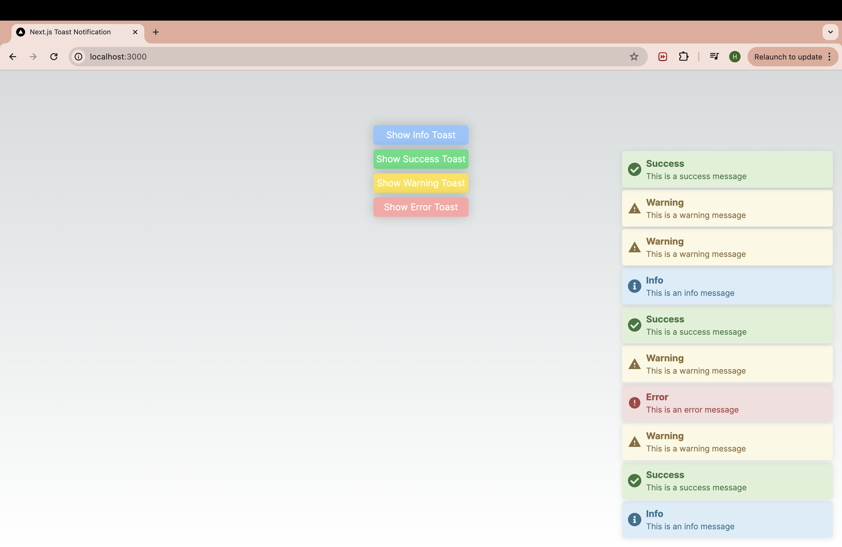
Step 5. Use the Toast System
You can now use the toast system in any component. Here’s a simple example of a page that triggers toast notifications.
"use client";

import { useToast } from "./contexts/toastContext";

export default function Home() {
  const { showError, showInfo, showSuccess, showWarning } = useToast();

  return (
    <main className="main-container flex min-h-screen flex-col items-center justify-between p-24">
      <div className="flex flex-col gap-2">
        <button
          className="bg-blue-300 hover:bg-blue-400"
          onClick={() => showInfo('Info', 'This is an info message')}
        >
          Show Info Toast
        </button>
        <button
          className="bg-green-300 hover:bg-green-400"
          onClick={() => showSuccess('Success', 'This is a success message')}
        >
          Show Success Toast
        </button>
        <button
          className="bg-yellow-300 hover:bg-yellow-400"
          onClick={() => showWarning('Warning', 'This is a warning message')}
        >
          Show Warning Toast
        </button>
        <button
          className="bg-red-300 hover:bg-red-400"
          onClick={() => showError('Error', 'This is an error message')}
        >
          Show Error Toast
        </button>
      </div>
    </main>
  );
}
Conclusion
By following this guide, you’ve successfully set up a robust toast notification system in your Next.js project. Utilizing createPortal to render notifications ensures they are prominently displayed, enhancing the user experience. The full code for this project is available here. Feel free to explore and customize the code to fit your specific needs.
Please share your thoughts, suggestions, or any issues you encounter. Happy coding!

Leave a comment