Implement Drag and Drop for React App with React DnD
Background
I was quite new to the realm of UI/UX development when I first joined my team. Drag and Drop is one of the early features of the app I got to work on, and in this article, I would like to articulate things I learned along the way.
Why DnD?
The below figure is the simplified layout of the React app I’ve been working on. In the middle, the app contains as many as 100 items in a grid. The user chooses items from the grid and the selected ones appear in a list that saves the user’s choices.
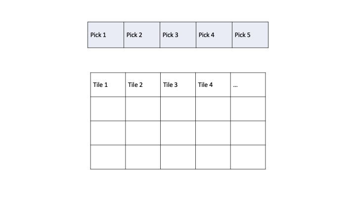
Figure 1. Simplified Layout of React App
My discretion was that the most intuitive approach here is to allow the user to select tiles using drag and drop. In the following section, we’ll find out how to actually implement the feature for React apps.
Implement Drag and Drop with React DnD
First and foremost, download the library with the following command:
npm install react-dnd react-dnd-html5-backend
The second one allows you to use React DnD with the HTMP5 drag and drop API under the hood.
The configuration required to use React DnD in the code is pretty much straightforward. It is divided into three parts: setup of DndProvider, draggable, and droppable.
Set up DndProvider
Place DndProvider near the top of your app and specify backend as HTML5Backend. This is my index.tsx file.
import React from 'react';
import ReactDOM from 'react-dom/client';
import { BrowserRouter } from 'react-router-dom';
import { DndProvider } from 'react-dnd';
import { HTML5Backend } from 'react-dnd-html5-backend';
import './index.css';
import App from './App';

const root = ReactDOM.createRoot(
  document.getElementById('root') as HTMLElement
);

root.render(
  <DndProvider backend={HTML5Backend}>
    <BrowserRouter>
      <React.StrictMode>
        <App />
      </React.StrictMode>
    </BrowserRouter>
  </DndProvider>
);
Set up Draggable Component
Make your component draggable using the useDrag() hook. In my case, it’s each tile(item) rendered in the grid.
import React, { useState, useEffect } from "react";
import { useDrag } from 'react-dnd';

// interface
import Tile from "../../interfaces/Tile";

// endpoint
import endpoints from "../../endpoints.config";

// context
import { useSelectContext } from "../../contexts/SelectContext";

interface TileProps {
  index: number;
  tile: Tile;
  onDragStart: () => void;
  onDragEnd: () => void;
}

const Tile: React.FC<TileProps> = ({
  index, // item's index in the grid
  tile,
  onDragStart,
  onDragEnd
}) => {
  const [isDropped, setIsDropped] = useState(false);

  const [{ isDragging }, drag] = useDrag(() => ({
    type: 'tile',
    item: { type: 'tile', tile: tile }, // the item passed in to the tile
    canDrag: !isDropped, // enable dragging only if the tile is not dropped
    collect: monitor => ({
      isDragging: !!monitor.isDragging(),
    }),
    end: (item, monitor) => {
      // reference: https://react-dnd.github.io/react-dnd/docs/api/drop-target-monitor
      const didDrop = monitor.didDrop();
      if (didDrop) {
        setIsDropped(true);
      };
      onDragEnd(); // notify the parent component when dragging ends
    }
  }));

  return (
    <div
      ref={drag}
      id={`tile-${index}`}
      key={index}
      className={`transform hover:scale-110 transition-transform duration-300 // increase the size on hover
        ${isDragging
          ? 'opacity-50 shadow-lg cursor-grabbing ease-in-out'
          : 'opacity-100 cursor-pointer ease-in-out'}
        ${isDropped
          ? 'grayscale pointer-events-none'
          : 'pointer-events-auto'}
      `}
      onMouseDown={onDragStart} // notify the parent component when dragging starts
    >
      <img
        className="mx-auto rounded-lg cursor-pointer filter"
        src={`${endpoints.IMG_URL}${tile.image}`}
        alt={`${tile.image}`}
      />
    </div>
  );
};

export default Tile;
The parts worth highlighting here are as follows:
- Customize visual effects while the user is dragging an object - use the
isDragginghook for this. - Use
monitor.didDrop()to be informed of when a drop has finished.endis called when the dragging stops, so make sure to update any state variables if you have any in theendobject. In my code,isDroppedis maintained to track the availability of each tile.
Set up Droppable Component
Fianlly, the component to be filled with draggable components. This is the Pick component, which is basically a drop zone.
import React, { useState } from "react";
import { MdCancel } from "react-icons/md";
import { useDrop } from 'react-dnd';

// interfaces
import { TileList } from "../../interfaces/TileList";

interface PickProps {
  tileList: TileList;
  setTileList: React.Dispatch<React.SetStateAction<TileList>>;
  index: number;
};

const Pick: React.FC<PickProps> = ({
  tileList,
  setTileList,
  index,
}) => {
  const [isHovered, setHovered] = useState(false);
  const [isLoading, setLoading] = useState(false);

  // handle functions for mouse entering and leaving
  const handleMouseEnter = () => {
    setHovered(true);
  };
  const handleMouseLeave = () => {
    setHovered(false);
  };

  // function to handle remove button click
  //  - makes the selected tile disappear from the lists when clicked
  //  - makes the tile draggable again
  const handleRemoveClick = () => {
    setTileList((prevTileList) => ({
      ...prevTileList,
      [index]: null,
    }));
  };

  // DnD - drop configuration
  // reference: https://react-dnd.github.io/react-dnd/docs/api/use-drop
  const [{ isOver }, drop] = useDrop({
    accept: 'tile',
    drop: (item: any) => {
      // force re-render after updating the list
      setTileList((prevTileList) => ({
        ...prevTileList,
        [index]: item['tile'],
      }));
    },
    canDrop: () => {
      // logic removed
    },
    collect: (monitor) => ({
      isOver: !!monitor.isOver(),
    })
  });

    // logic for getting image value removed
  const backgroundStyle: React.CSSProperties = {
    backgroundImage: image
      ? `url(${IMG_URL}/${image})`
      : 'none',
  };

  return (
    <div
      className={`bg-[#292c33] aspect-square rounded-lg outline-dashed overflow-hidden ${
        isOver ? 'outline-blue-500' : 'outline-[#444a4f]'
      } relative`}
      onMouseEnter={handleMouseEnter}
      onMouseLeave={handleMouseLeave}
      style={backgroundStyle}
      ref={drop}
    >
      {tileList[index] && isHovered && (
        <button
          className={
            `text-white opacity-0 hover:opacity-70 top-1/2 left-1/2 h-full w-full
            transform -translate-x-1/2 transition-opacity -translate-y-1/2 relative rounded-full
            p-1 delay-75 duration-300 ease-in-out`
          }
          onClick={handleRemoveClick}
        >
          <MdCancel className="w-full h-full" />
        </button>
      )}
    </div>
  );
}

export default Pick;
Hoping the logic that I needed for the user to undo selections do not confuse you, I’d like to point out several things here:
- Specify accepted type(s) in
useDroplike I did if there are multiple draggable types in your app. It’s out of this article’s scope so the final code was excluded from the above code snippet. I also had to make droppable objects draggable so that users can exchange locations of selected items. If you’re in need of multiple draggable objects, pass an array of types to accept. e.g,accept: ['item1', 'item2'] - Using
canDrop, you can control when it should accept a drop or not. Returnfalseortruebased on your requirements.
Closing Thoughts
Navigating UI/UX territory as a newbie brought its fair share of challenges, especially when tasked with adding a Drag and Drop (DnD) feature to our React app. Choosing React DnD made the process smoother and more in tune with our app’s needs.
For me, the project wasn’t just about features; it laid the groundwork for understanding user-friendly design. Here’s to the UI/UX journey - where every click is a step toward better interfaces! 🚀

Leave a comment